Colors and Math
This was quite a rabbit hole, I entered it after a short confusion about the properties of color and it absorbed me for a whole evening and night. I tried to reason my way through with basic linear algebra and figured I should package it into a post, as color theory is a great toy example to intuitively grasp some fundamental math concepts.
This post will test your spatial cognition. Why? Because I will not provide much visualization (I am lazy). And mental imagination is more fun anyways. So what the fuck are colors and where do they come from?
The Input Signal
Colors are a modeled property of light. Photons come in different nanometer wavelenghts, determining the energy level. However, colors are not just a specific wavelength range as commonly assumed. Otherwise magenta would not exist, as it is a mix of short (blue) and long (red) wavelengths. We actually receive whole spectral power distributions of light and map those to colors.
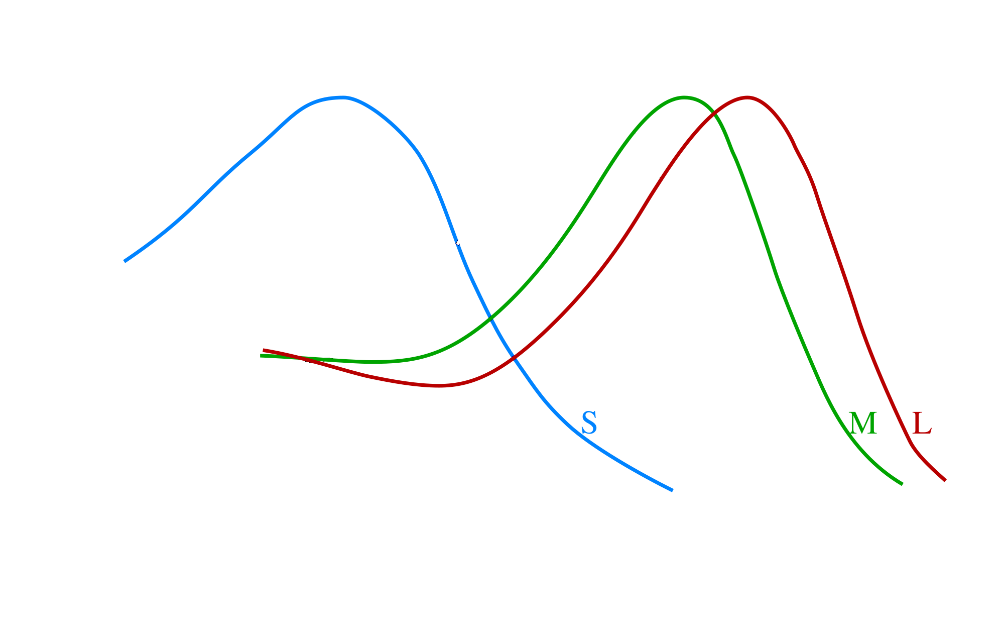
Those power distributions are sensed by 3 types of cones (L=long, M=medium, S=short) and one type of rod (R).
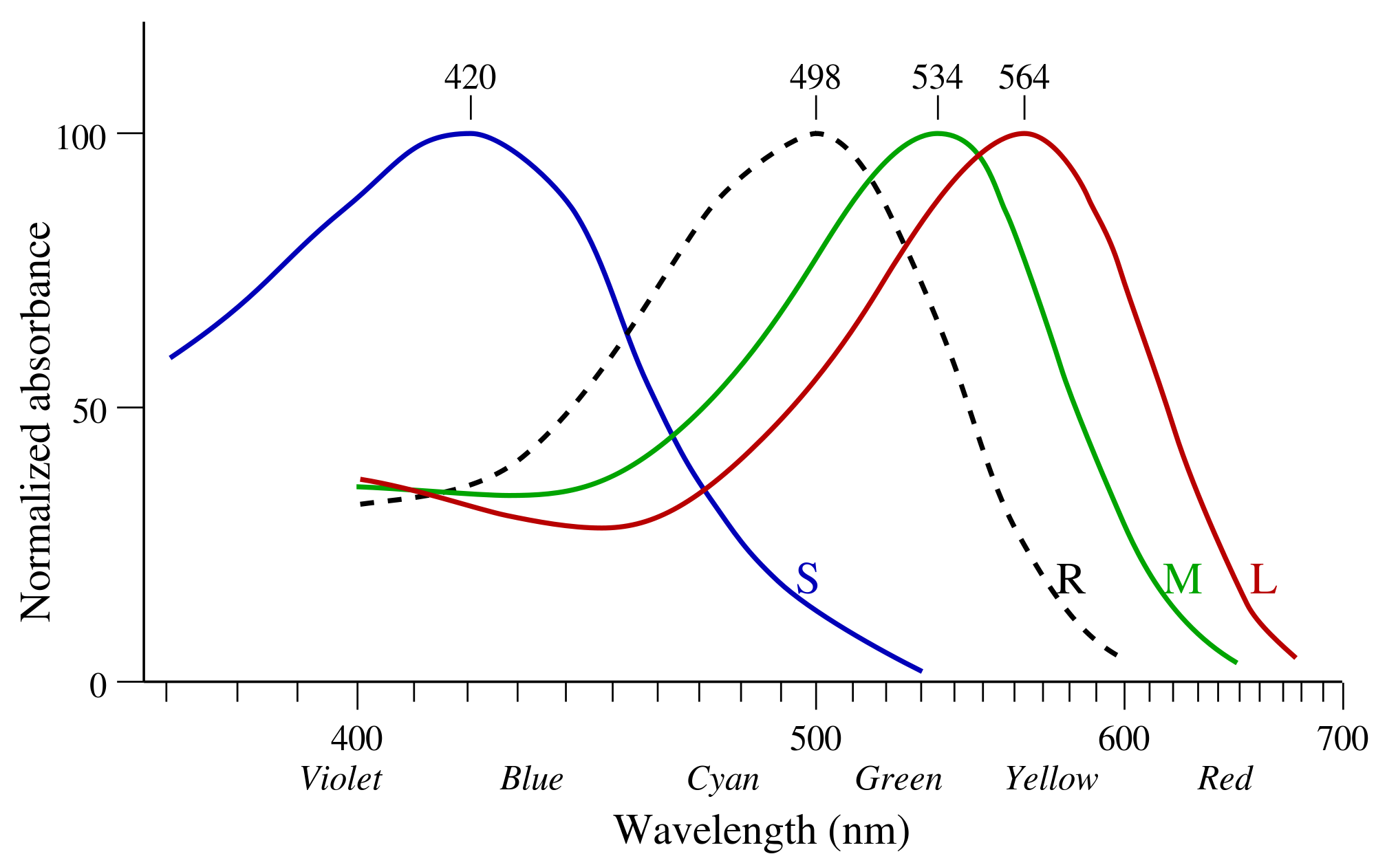
 https://de.wikipedia.org/wiki/Datei:Cone-absorbance-en.svg
The y-axis shows the relative efficiency of a cone/rod in absorbing photons at the given wavelength normalized by its max. L and M cones make up 90-95% of all photoreceptors, while S cones make up the rest. Furthermore, yellow pigment in the macula filters out a lot of the high-energy light, meaning the S cones receive even less signal. One reason why we filter out so much blue light is to protect us from its high energy, evolutionary this also plays into our cards as blue is a rare color in nature, while green is dominant and therefore higher color resolution is needed for green than for blue.
Why is blue rare? The core reason is molecular resilience: To appear blue, a pigment must possess a molecular structure capable of absorbing low-energy, while reflecting high-energy. To absorb low-energy light (red/yellow), a molecule’s electrons must hold together loosely so they can be excited by weak, long-wavelength photons. However, these same loose electron bonds are easily shattered or permanently rearranged (photobleaching) when struck by high-energy blue photons. It is therefore chemically and metabolically expensive, and evolution selects against expensive solutions. Great! Us protecting against blue light is not giving us a disadvantage when navigating nature.
Ok so the cones are related to sensing the spectral power distribution of incoming light and parse it into bioelectrical signal for further processing. What is the role of the rods? Their absolute absorption is 2 to 3 magnitudes above the cone absorption efficiency, they can be triggered by single photons. That makes them extremely well suited for low-light vision, e.g. night vision, but as rods have no differentiation in wavelengths, they do not provide a compositional basis for color. Instead they are in a smoothed XOR relationship, bright light “bleaches” the rods, shifting the neural bus to the 3-channel cone system, while with low light only the rod signal is passed.
\[R \oplus (S \lor M \lor L)\]So yes: In the dark, all cats are grey.
Mapping Signal to Color: Color Bases
Let’s put our math fedoras on. The output, called photocurrent, of each cone is computed by the integral of the incoming spectral distribution against its own sensitivity curve. Integration can not retain all the original information, it is not injective, meaning different power distributions can map to the same output. This is one of the many reasons for the phenomenon of metamerism, which I will dedicate a chapter to in the later part of this post.
But how are the cone signals mapped to colors? This happens by recombining the three cone inputs in the retinal ganglion cells and the visual cortex into 3 orthogonal channels. The following transformation ignores the weights of the incoming signals and only shows the main signal sources to make later calculations cleanly imaginable w.l.o.g.
- Luminance: $Y = L + M$
- Red-Green: $RG = L - M$
- Blue-Yellow: $BY = S - (L+M)$
So there you have it: The opponent process model, the basis transformation for human color perception (At least for trichromats, we will come back to tetrachromats later on). In math terms, our brain diagonalizes the covariance structure via the luminance/RG/BY decomposition. This is pretty much like biologically implemented PCA: the opponent channels are close to the eigenvectors of the covariance matrix of natural image statistics in cone space!
But as a fellow color normie, I usually think in the RGB color basis. So let’s get a better intuition on the RGB basis, as well as the metrics for choosing a color basis and the mapping of the human color basis into RGB space.
As shown above the perceptible human colorspace is 3D (at least for trichromats). If we want to generate any color given 3 degrees of freedom we only need to define a non-colinear basis in human color space. Non-colinearity ensures that our 3 basis vectors span a volume in our 3D “Luminance, Red-Green, Blue-Yellow” space (here referred to as human color space). This makes a lot of weird combinations possible, we could have really short and closeby (i.e. minimally different colors), but non-colinear base to represent all colors. The practical limitation is the resolution of our sensors, our cones. Visualize that: what happens if the volume spanned by the basis vectors is small relative to the volume of visible color in human color space? The answer is that this means we need to multiply the bases by larger value ranges to cover the same space, i.e. our resolution would need to be higher to represent the same volume of color. This leads to a lower range of colors (Gamut) that can be reconstructed.
Therefore a good artificial color basis should span a high fraction of the human color volume. And for anyone ever having a hard time interpreting the meaning of the determinant: the absolute value of the determinant gives us precisely the volume spanned by the column vectors of the matrix (which here, are our basis vectors). And that is why the RGB basis works relatively well, the absolute value of its determinant in human color space is high and spans a large fraction of the volume of perceptible colors.
At this point it would be good to swap perspectives and look at the geometry of RGB space instead of human color space to explain the different properties of color. RGB spans a euclidean space. Color Space is a bit too loose, actually colors are compositional therefore they are best described in a finite volume in space. RGB can be defined in a unit cube spanning the volume $[0,1]^3$. A color $c$ is then a vector $[r,g,b]^T$ in this volume. We can map to different properties from the color in RGB space, for example we can define a color by Hue, Saturation, Luminance (HSL) or by Chromaticity and Intensity.
RGB representation
- Chromaticity is the direction in colorspace, and as the direction is fully defined by the surface of the unit sphere, chromaticity is 2D.
- Total Intensity is the magnitude (length) of the vector.
Cylindrical RGB decomposition
- Intensity (objective brightness) is defined via the diagonal $l$ where $R=G=B$. Projecting $c$ onto the unit vector $\hat{l}$ along $l$ gives the intensity, which is simply the dot-product $c^T\hat{l}$.
- Chroma is the distance of $c$ from the diagonal $l$, i.e. the length of the component of $c$ perpendicular to $l$.
- Saturation is the normalized chroma: chroma divided by intensity.
- Hue, which is what we usually mean when we name basic colors e.g. “red” or “orange”, is the rotation of $c$ around the diagonal $l$.
This is exactly a transformation into cylindrical coordinates along the intensity/luminance diagonal. HSL and HSV are both close to this decomposition, differing mainly in how they define their luminance axis.
Some colors combine mix attributes, e.g. “rose” which implies lower saturation and higher brightness, combined with magenta hue. If you could keep up with the mental visualization, you probably already fell in awe with how color qualia and the geometry beautifully intertwine. But it gets even more satisfying as we will uncover visual phenomenons by mathematical necessity.
Projecting the Human Color Basis into RGB Space
Now let us map the human color base (luminance, red-green, blue-yellow) into RGB space. Luminance is easy, it should map right on our diagonal, at least when ignoring the precise weights accounting for the biases in cone population and sensitivity (empirically the real diagonal is believed to lie around $Y=0.2126R+0.7152G+0.0722B$). Again for simplicity let’s ignore the factors and focus on the main contributors. Given the already existing luminance diagonal, Red-Green (RG) simply ranges from Red $(1,0,0)$ to Green $(0,1,0)$, with direction vector $(-1,1,0)$. This is orthogonal to the diagonal $(1,1,1)$ since $(-1)\cdot1 + 1\cdot1 + 0\cdot1 = 0$. The Blue-Yellow (BY) direction goes from Blue $(0,0,1)$ to Yellow $(1,1,0)$, with direction vector $(1,1,-1)$. The key geometric reason it fails to be orthogonal is that the two endpoints sit at different distances. So BY inherently has an asymmetry along the luminance axis — moving from blue to yellow increases luminance, meaning the axis is tilted relative to the diagonal. Their dot product gives an angle of $\approx 70.5°$ rather than $90°$, so BY and luminance are genuinely correlated even in the simplified model. As I said you will need to visualize heavily this post but this here, may have been the hardest part already.
This geometric correlation has a direct perceptual consequence: you cannot shift along the BY axis without also shifting luminance slightly. This is precisely the Abney Effect: when you increase the brightness of a blue or yellow hue, the hue itself appears to shift, because in perceptual space luminance and BY are entangled rather than independent axes. Theory is enough, I mean, who needs empirical testing anyways…
When considering the RGB cube, there is another theoretical implication: BY spans $\sqrt{3}$ in the unit cube, while RG spans $\sqrt{2}$. So BY covers a longer range, which is another geometric reason for our reduced color resolution between blue and yellow.
The Helmholtz-Kohlrausch Effect
Another interesting phenomenon describes non-linearity in human color perception in RGB. It is called the Helmholtz–Kohlrausch effect and describes the phenomenon of perceived brightness shifting with hue and saturation.
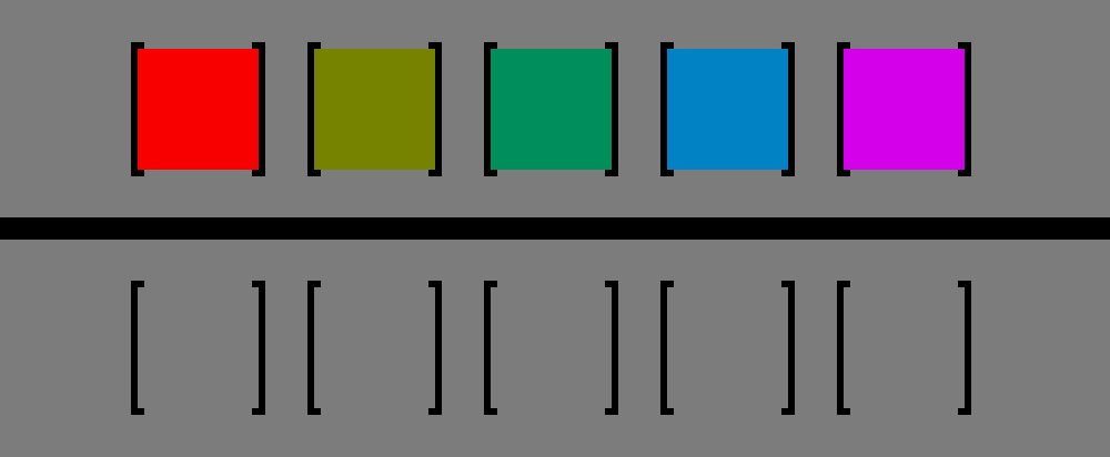 https://en.wikipedia.org/wiki/Helmholtz–Kohlrausch_effect#/media/File:Helmholtz-Kohlrausch_effect_visualized_improved.png
In the graphic above, all colors have the same luminance, despite red and pink appearing to be way brighter than the yellow box. If you take the grayscale of this image, you will end up with the bottom row, indicating identical luminance. Exceptions to this effect are people who have a red-green colorblindness. Commonly, this colorblindness is due to the M and L cones overlapping too much, with either M (Deuteranomaly) being shifted towards L, or vice-versa (Protanomaly).
But what does that effect imply for our RGB space? It means that the RG-BY plane perpendicular to the luminance diagonal is actually not a plane for a fixed perceived brightness. The surface with constant brightness in RGB space is a lobsided bowl shaped surface, that curves down the further away the points are from the luminance diagonal, with steeper descent along reddish and bluish hue rotations.
Color Theory is the perfect toy example for a lot of fundamental mathematical theory in branches such as linear algebra and multivariate calculus:
- We can apply Line Integrals to map straight lines in RGB to curved paths in perceptual space.
- We can compute the Jacobian of the transformation into perceptual color space, to analyze local stretches and rotations.
- We can derive CIELAB, a color space designed so that euclidean distance between two points approximates perceived color difference uniformly, by flattening the smooth manifold of perceptual color space, finding coordinates where the metric tensor is approximately the identity
Tetrachromats
I mentioned tetrachromacy in a previous post. This topic is fascinating, similarily to why trying to understand higher dimensional spaces is fascinating to me: visualizing something that can not be visualized. Our imagination does not allow for visualizing four spatial dimensions, by arguably the same reason why we can not imagine a color we have never seen.
Actually seeing a color you have never seen before is possible using lasers, only a few people in the world have experienced the color Olo, a color induced by selectively triggering the M cones, something that naturally never occurs.
Tetrachromats, as the name implies, have a fourth type of cone. Since the L and M cone genes sit on the X chromosome, women can carry two slightly different variants one on each chromosome. Around 12% of women carry the altered gene allowing for the fourth cone type, but only a very small fraction of them actually process this extra signal into a distinct perceptual dimension. Those who do (“strong” tetrachromacy) have highly increased differentiation in color perception, though how many carriers achieve this remains an open research question.
The fourth cone $L’$ typically resides between $M$ and $L$, potentially adding a third chromatic signal \(X = L' - \frac{L+M}{2}\) to the transformation, which measures how $L’$ deviates from the midpoint between the L and M responses. Crucially, $L’$ has its own distinct sensitivity curve, so this is genuinely new information. It resolves fine spectral structure in the yellow-orange region that L and M together average over and cannot distinguish. This expands the trichromatic basis with an additional Yellow-Red or Yellow-Green region (at least in trichromatic terms, we do not have names for these perceived colors). This basis expansion gives them a high differentiation for Yellow, making natural pigments like skin, fruits and leaves that appear flatly colored to trichromats, really colorful and textured. This phenomenon is rare and I could not find much research on mapping the tetrachromatic space [1, 2].
The first paper claims that over 50% of women are genetically tetrachromatic, citing a source that actually describes meiotic misalignment probability, not population prevalence. Such a sloppy mistake likely does not stand alone, so if you read this be vigilant.
Metamerisms and testing Tetrachromacy
One way to test tetrachromacy experimentally would be to create trichromatic metamers (pairs of different spectral distributions which are perceptually indistinguishable to trichromats), which are distinguishable to the tetrachromat. These stimuli would vary along exactly the one dimension of spectral variation that lies in the null space (also called kernel) of the trichromatic transformation $\ker(T_3)$ but not in $\ker(T_4)$, which means moving along this axis leaves the trichromatic percept unchanged while changing the tetrachromatic one. So the null space is exactly the set of all spectral variations a visual system cannot detect. Since the tetrachromat has one additional cone, their null space is strictly smaller, meaning there are fewer invisible directions in spectral space.
Digital color bases like RGB are strictly 3D, they may look dull from the perspective of a tetrachromat. But by using lasers or an analog photo projector we could build experiments where we map the resolution and dimensions of tetrachromatic color space, identifying the fourth axis and the metamers it resolves.
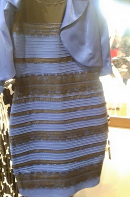
The Inverse of Metamerisms: The Golden Dress
Not only do different spectral distributions map to the same colors, but there are also inverse metamerisms (actually known under “color constancy”), where the same spectral distribution maps to totally different colors. The most fascinating example is the golden dress, which in my humble opinion, is without a doubt, golden-white. But apparently there is a big proportion (~74%) of people who are able to see that this dress is in fact blue and black!
 https://web.archive.org/web/20150227014959/http://swiked.tumblr.com/post/112073818575/guys-please-help-me-is-this-dress-white-and
The reason for this phenomenon is that our brain adjusts colors according to lighting and there are individuals differences. The visual system does not just passively transduce light but actively estimates illumination, trying to discount the color of the light source to recover the true surface reflectance. This is essentially the brain solving an underdetermined inverse problem: given the cone responses, infer both the illuminant and the surface reflectance, which are confounded. So the dress image is ambiguous because the illumination context is unclear. The visual system has to make a prior assumption about the illuminant:
- If your visual system assumes the dress is in shadow (bluish illuminant), it discounts the blue, and infers the surface must be white/gold.
- If your visual system assumes the dress is under artificial warm light, it discounts the warm colors and infers blue/black.
So to everyone who sees the dress as black and blue, get out, breath some fresh air, and stay out of the sun, you probably got a few sunstrokes too much.